The
Opportunity
Hub
— 2018
Brand identity development and art direction for The Opportunity Hub, including custom design assets, photo direction, and adaptable templates to help them connect meaningfully with students and alumni.
CLIENT —
University of Michigan, College of Literature, Science, and the Arts; The Opportunity Hub
MY ROLE —
Brand Identity Design, Art Direction, Photography, Illustration, Graphic Design, Print Production
MORE INFO —
As a new initiative within the College of LSA, The Opportunity Hub needed a compelling visual identity to distinguish itself while aligning with the broader University of Michigan brand. I led the art direction and design strategy to help shape the Hub's presence from the ground up—crafting a cohesive system that would connect with students, alumni, and employers alike.
Working within established brand parameters, I developed an extended visual language that included a refined color palette, hand-drawn custom typography, a suite of graphic elements, Photoshop brushes, and flexible design templates for both print and digital communications. To support storytelling and build a strong visual voice, I conducted original photoshoots and art directed freelance photographers, resulting in a robust and purposeful image library.
In addition to producing a wide range of promotional and editorial materials, I created brand guidelines to ensure consistency across all touchpoints—laying the foundation for the Hub’s long-term growth and recognition.
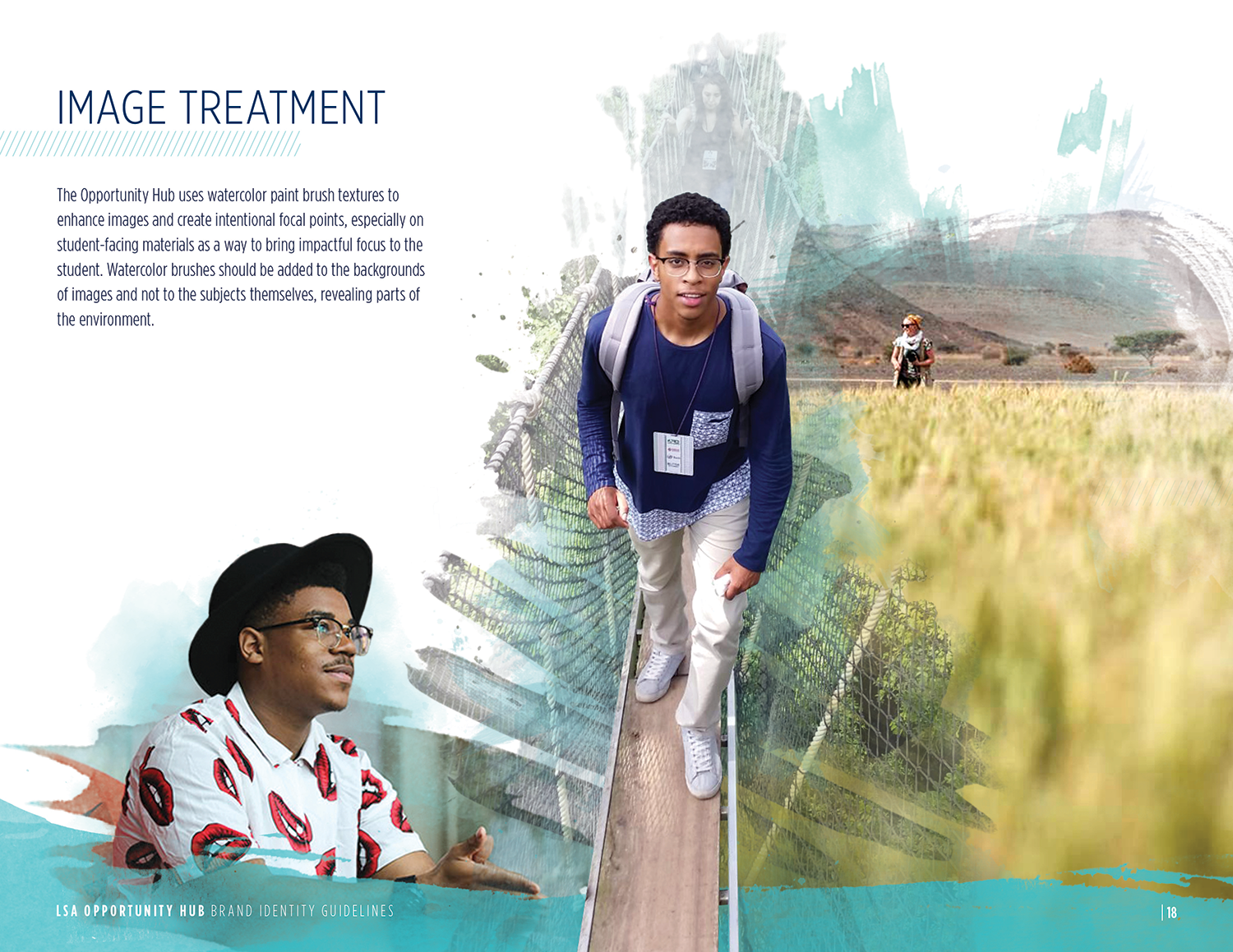
Brand Guidelines
Select pages from the Opportunity Hub brand guidelines.


Brand Templates
Templates at various sizes for multiple platforms. I prioritized typographic hierarchy, sample images, and color palettes for easy editing by the Opportunity Hub staff.

Custom Typeface: OH! Font
To help the Opportunity Hub establish a more approachable and distinctive visual identity, I created a custom hand-drawn typeface. Designed to complement the University of Michigan’s brand while standing out to students, the typeface brought a sense of personality and warmth to the Hub’s communications and became a key element of its visual language.

